
Table of Contents
ToggleUnveiling the Secrets of a Responsive Website: A Definitive Guide by Devki Infotech
Understanding of Responsive Design
Fluid Grids: The Foundation of Adaptability
Flexible Images: Visual Consistency Across Devices
Media Queries: Customizing Every User’s Experience
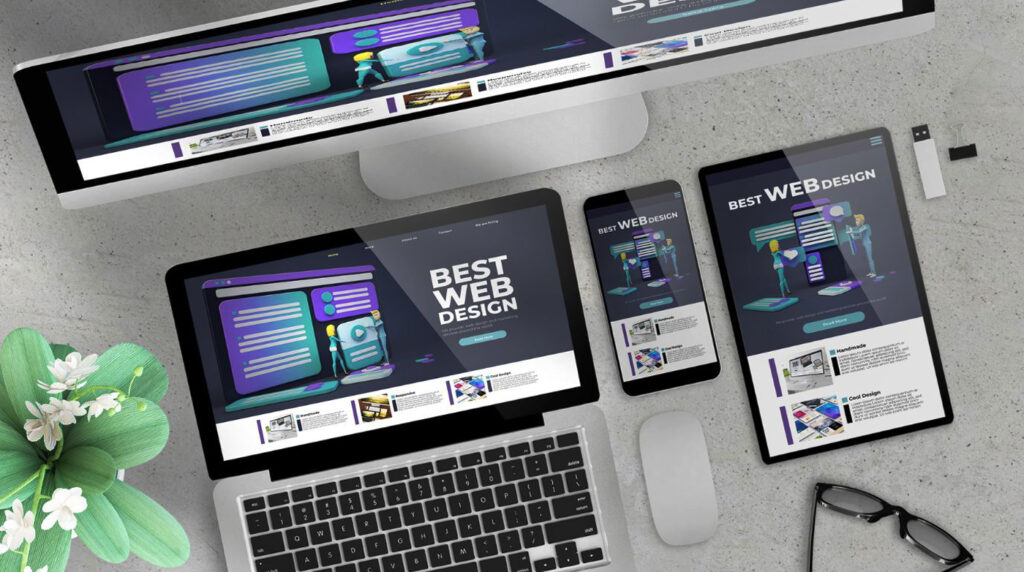
Essential Elements of a Responsive Website
Mobile-First Philosophy: Prioritizing Accessibility and Usability
Speed Optimization: Accelerating Digital Experiences
In today’s fast-paced digital landscape, speed is paramount. By maximizing website performance through techniques like reducing HTTP requests, optimizing pictures, utilizing browser caching, and utilizing content delivery networks (CDNs), Devki Infotech places a high priority on quick loading times. By delivering swift and responsive experiences, we enhance user satisfaction and retention.
Intuitive Navigation: Guiding Users Seamlessly
Touch-Friendly Design: Enhancing Mobile Interactions
Cross-Browser Compatibility: Ensuring Universality
Conclusion: Empowering Digital Excellence
In conclusion, in the complex world of today, a responsive website is the pinnacle of digital perfection. Devki Infotech’s commitment to responsive design principles and meticulous attention to essential elements such as fluid grids, flexible images, and intuitive navigation culminates in unparalleled user experiences. By embracing a mobile-first approach, prioritizing fast loading times, and ensuring cross-browser compatibility, we empower businesses to thrive in the digital realm, leaving an indelible mark on their audiences.